Artwork, Shmartwork; is it really all that important?
There’s an old saying in the design world: Garbage in, garbage out. We will always do our very best with artwork provided to us, but starting with high-quality images and files that are properly created will produce premium results and allow the project to progress without unnecessary delays.
How do I know exactly what you’ll need for a project?
If you have questions about a project, call us and let us help you navigate the waters! We not only produce great materials, we can help you strategize your entire marketing plan to create cohesive campaigns that look great and engage your audience. Let our experience and knowledge take the driver’s seat in getting you noticed!
So… what is “image resolution,” and why should I care?
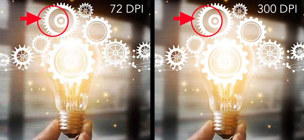
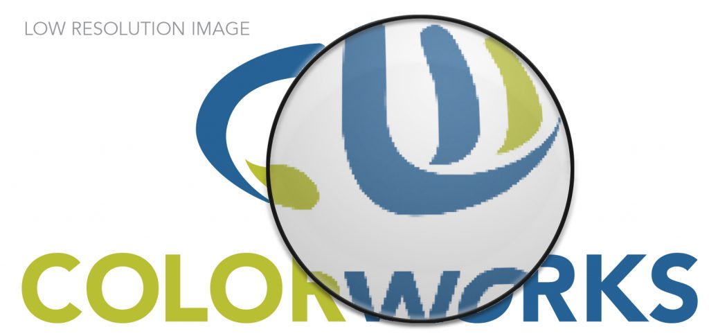
“Resolution” refers to the spacing of pixels within a bitmap image and is measured in Dots Per Inch (DPI). The higher the resolution—meaning, the more pixels in the image—the more detail and subtle color transitions there will be on the printed piece (a good thing)! An image with high resolution is clear and crisp with clean, smooth edges and sharp detail. The lower the resolution—that is, the fewer pixels in an image—the blurrier or more “pixilated” it’s going to be.

Did you say “Bitmap?” What’s that?
Bitmap images are resolution-dependent, meaning their quality depends on the resolution of the output device. These types of images, such as photographs, are made up of small squares called “pixels.” Again, the higher the number of pixels in the image (the higher the resolution), the better the image quality! Lower resolution results in pixilated and jagged edges in photos and flat graphics. Some extensions you’ll see for bitmap images include .tif, .psd, .png and .jpg.
What determines acceptable bitmap artwork?
Industry standards dictate that an image must be at least 300 DPI at the size at which it will be printed. In other words, a photo that needs to be 4 inches wide on a printed piece will need to be at least 300 DPI when it is produced at 4 inches wide. We can downsize an image without losing quality, but if we need to enlarge it, it will lose clarity.
A few things to remember about bitmaps:
- Bitmap image colors cannot be changed easily
- A bitmap image cannot be edited quickly
- Image quality is dependent on resolution. A low-resolution image will not print clearly.
- The quality (smoothness) of lines and shapes will degrade when a bitmap image is enlarged.
- Bitmap text will become unreadable at small sizes or low resolution.
Okay, so what is “vector” artwork and why is it best for flat (non-photo) graphics? How is it different than a bitmap image?
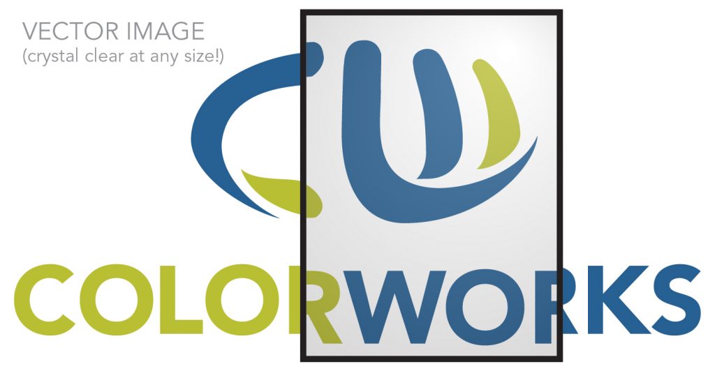
A vector image consists of lines and curves defined by mathematical objects called “vectors.” These vectors are little points that can be manipulated by clicking and moving them. Think of a piece of string wrapped around 4 different thumbtacks. You can press the thumbtacks to a board, with each tack placed at a separate corner to make a square. If you move a tack, you can change the shape the thread makes. Imagine vector anchor points as those tacks (which can be manipulated to change straight lines to curved!).
Vector images print clearly at any size, and can be manipulated easily to change color and shape. When working with logos and flat graphics, vector images are the way to go!
Some extensions you’ll see for vector images are .eps, .ai and .pdf (not all PDFs are vector-based, but they can be if saved properly). Oftentimes, you will not be able to open a vector piece of artwork, but it may be exactly what we need. Send us all of the artwork you have, even if you can’t open it!
A few things to remember about vectors and why we often require them:
- Vectors are easily editable for shape, size, and color.
- Images can be used in multiple applications without losing image quality.
- Type quality is clear at any size.
- Vector images are resolution independent. That means they will be as crystal clear at 1 inch as they would be if enlarged to the side of a building!
What are “native files?”
This term refers to the program in which the project was created. We accept InDesign, Illustrator and PhotoShop native files (If you have a file in another program, please contact us to see how we can help!). Each of these programs has its own use, and it’s important to use the correct program for your project:
- InDesign: Page layout program
- Best for designing brochures, flyers, postcards, etc.
- Illustrator: Vector graphics program
- Best for creating logos, flat graphics, ad specialty imprints, and large format layouts like banners, posters, etc.
- PhotoShop: Bitmap image / photo editing program
- Best for: color correcting, resizing, etc. photos
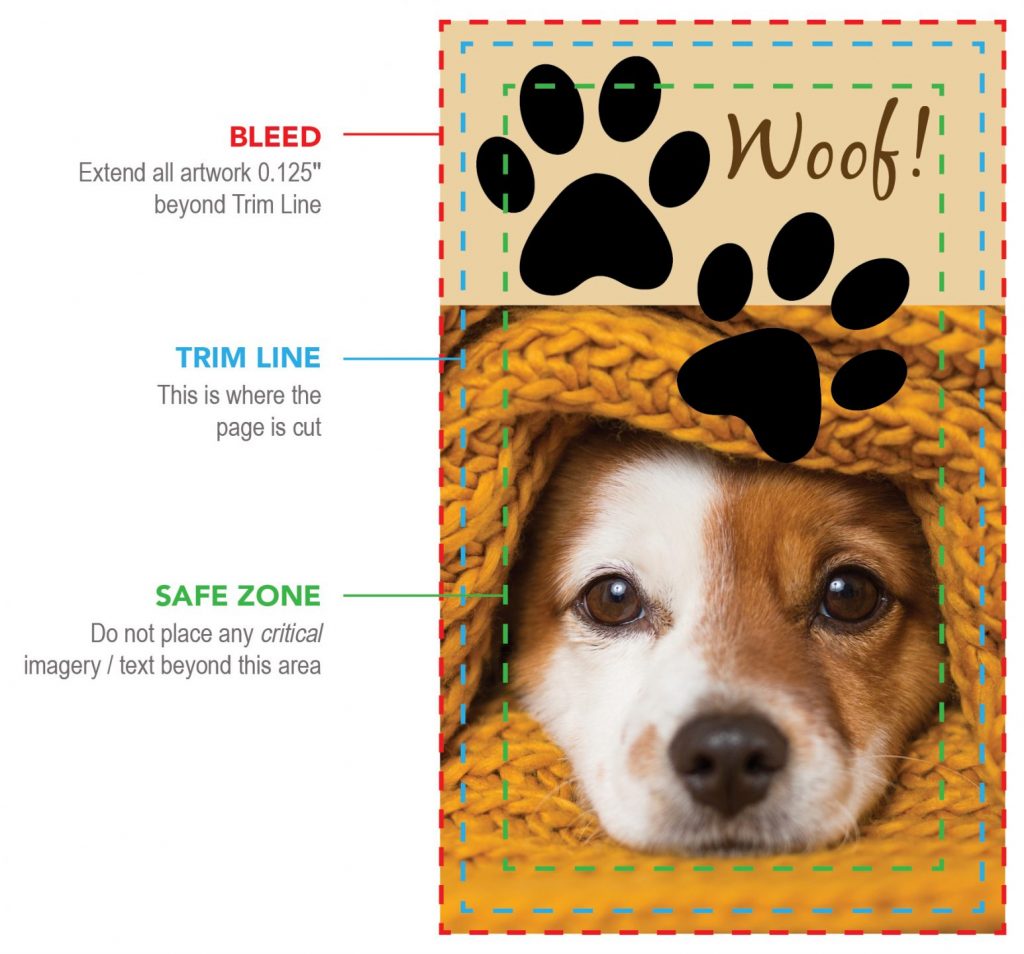
What is a “bleed” and “safe zone?”
If color or an image runs right to the edge of a piece, the color needs to extend beyond where the printer will cut the paper / material. This is known as the Bleed. It allows wiggle room so that there is no white edge of the paper showing should the cut not fall exactly on the edge between the color / image and the blank page (a nearly impossible feat). An eight of on an inch (0.125”) is required on all sides for most projects. For large format projects like banners and posters, we suggest 0.5.”
The Safe Zone is the area between the edge of the page and any critical text or images on the page. This area ensures that nothing will be cut should there be a slight shift when trimming the page. We suggest a quarter of an inch (0.25”) of safe zone around the entire perimeter of the piece (1” for a large-format project).
How about fonts?
It’s best to use only Adobe TypeKit fonts available through your Adobe programs. This will ensure seamless transition between your computer and ours as we will have access to those same fonts. If you need to use a third-party font, we can either try and match that font with one we have here, or you can send us the font you have.*
*If you are sending us fonts, please be sure you understand any possible transference restrictions in your font licensing agreement before sending them to us.
What about the color? CMYK, RGB, PMS… yikes!
There are different color processes that are used specifically in the print world, and others used solely for digital applications. Once you understand the difference, it’s easier to create artwork for those specific needs. Be sure to check back to our Insights page for an upcoming article in this series that will clearly define the differences and help you provide the correct color platform for your artwork! Until then, if you have any questions about color, please contact us for more info!
How do I know if I have the “right” artwork?
Have artwork you want us to use, but don’t know if it can be utilized? Send us what you have (even the files you can’t open), and we’ll analyze it, giving you suggestions for helping to make it work. If you’re not sure how to fix it, allow us to come up with a solution!
What if I don’t have the best artwork to send you?
Don’t have artwork you feel is appropriate for your needs? We are more than happy to rework—or redesign!—your projects, including logos (which will help you in all facets of your marketing), marketing materials, custom graphics and ad specialty imprints, just to name a few. We want to help you make that great first impression!
FREE Artwork Guidelines PDF to help you!
To help you further, we’ve created an Artwork Guidelines sheet that will give you some tips for providing us what we need to successfully produce your project.
CLICK HERE TO DOWNLOAD THE CW ARTWORK GUIDELINES.
Click Download the CW Artwork Guidelines Now!
Helping us understand your artwork needs.
Once we understand what you’re looking to accomplish with a piece, we may ask you some questions that will help us provide you our best work:
- Do you have a vector version of your logo you can provide to us?
- If not, would you like for us to redraw it as vector or, or create a new one for you?
- Do you have existing artwork you need for us to use in the project?
- Do you know if it meets the artwork requirements needed to produce a great piece? (CLICK HERE to download the CW Artwork Guidelines sheet!)
- If you’re not sure of the quality, send it to us and we’ll be happy to analyze it for you!
- Do you need for us to create any custom graphics for you? (We’d love to!)
Upcoming articles to help you with your artwork!
Look for upcoming articles in this series that will cover additional topics we hope you’ll find helpful!
Here are some of the things we’ll be covering:
- Digital artwork: How this artwork is setup differently than for print
- Color platform: The differentiations between full, spot color, and web color
- The Importance of Great Design: How thoughtful, quality design can take your materials to the next level
- Artwork Submission: How to appropriately package native files, or how to upload and use the CW PDF Print setting to prepare a CW print-ready PDF